Student Council Website
Table of Contents
Humble Beginnings

When I started out in university I didn’t pay much attention to the student council’s website. At first, I didn’t even know that there existed one. Not that that would have made a difference…
Yet a year later I found myself taking a closer look at the website to deliver a pleasant experience for the incoming freshmen.
I find that pleasant visuals are integral for any audience to have a positive experience. Even if the ultimate goal isn’t to make them stay on your website, but to enable the audience to retrieve the information they need from you and nothing more, it’s important to offer a positive experience. Maybe that was the reason that I always disliked the website. It wasn’t kind to the eyes; It was messy and disorganized by the constant change of hands it has gone through over time. There were remnants of long gone battles; Fingerprints of all kinds of problem solvers manhandling the software – Man vs. Machine – to various degrees of success.
When it was my time to update the website for the incoming freshmen, I got the full dose. At times I only changed a few details in a Markdown document, only to see that the order of the navigation buttons changed for a reason that was beyond me or the homepage giving way to a 404 error.
In the first student council meeting of the incoming semester, I did it again. The website broke and I had to fix it via my smartphone because I left my laptop at home. That’s when I joked I should just code the whole damn thing myself. Maybe then those problems would go away.
A Day’s Work
Well… there I was. I was about to do it. I opened my laptop and started copying the code from my own website (this website) and adapting it to the student council. Sometimes that sort of thing just works without a problem; You copy something over and it fits in like it was always meant to be there. Not this time…
I noticed a lot of problems about the code, that I had to get resolved, if I was serious about this. And so I resolved them. And I had new ideas. New inspirations. Which in turn lead to the improvement of my own website too.
As the youngest member of the student council, both in terms of age and of time spent in the student council, I wanted to touch the content and structure of the website as little as possible. So I carried over all the Markdown code and started work on binding the structure of the website to the folder/file hierarchy of the content directory. Somehow I decided against a proper Markdown to HTML package in favor of my own hack via pandoc. I believe one of the reasons was being able to define ids for headings, such that they are linkable – I learned later, that marked would have done the job.
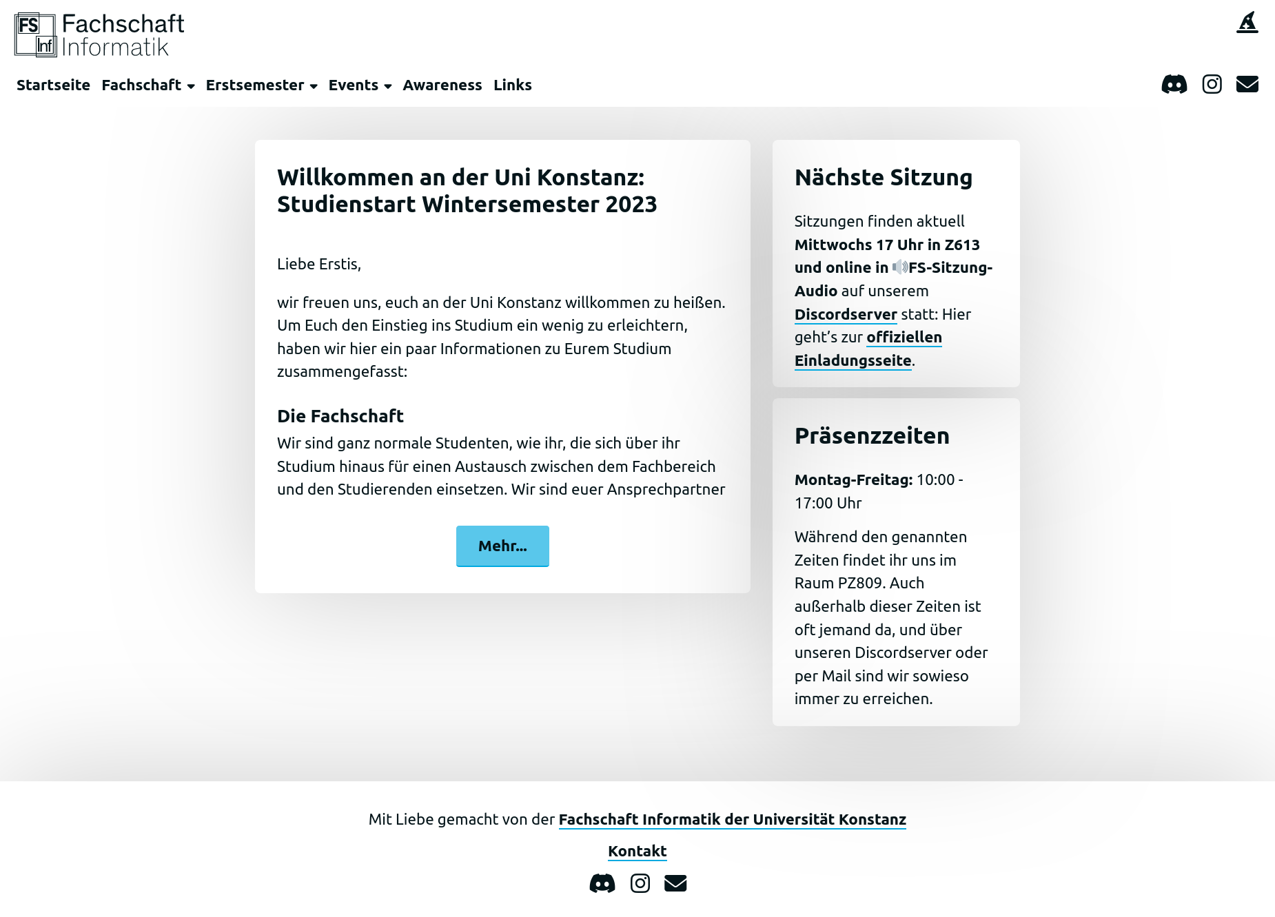
Some time was spent styling the website in rough accordance with the university website, though a lot of liberties were taken.
And yet more time was spent reworking the old Markdown code to take advantage of hyperlinks, to make the information clearer or just easier to navigate through. There were even some new additions, like a page dedicated to the university and the overarching structure of student participation within it – which was quite helpful when we had new additions to the student council and I had to explain the whole system in the easiest terms possible (it’s debatable whether or not I achieved those ends).
Further Improvements
Dark Mode
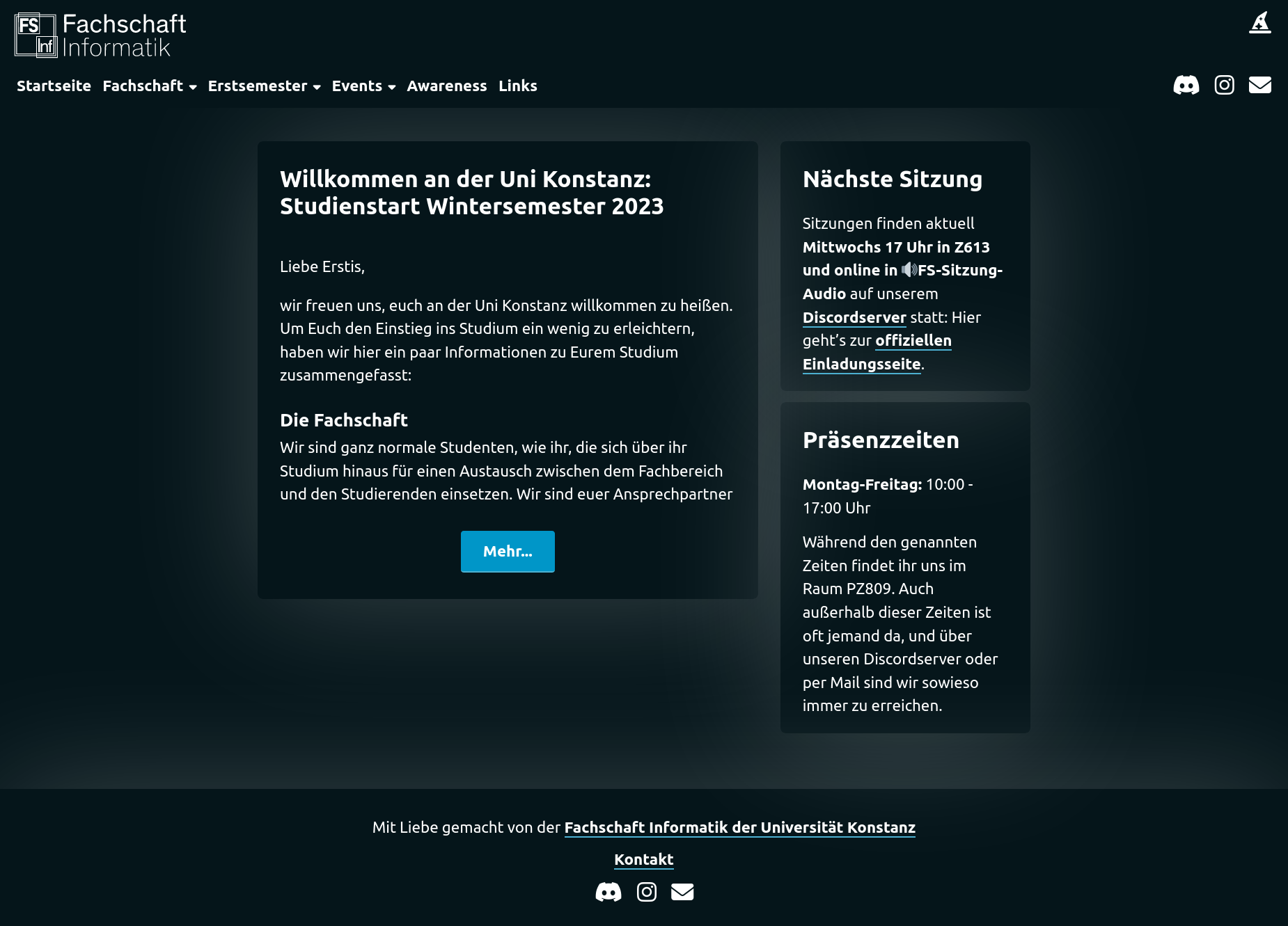
As soon as I showed my demo of the new website for the student council, the wish for a dark mode surfaced – I half expected that to be honest; What would a computer nerd be without their dark mode. I quite liked the light mode that I had stitched together, but I liked the challenge of hacking a color mode switch into existence.

The addition of the dark mode was fairly simple. I already got into the habit of working with CSS variables; possibly due to the emergence of Juxtopposed which gave the world the nifty little toy of Realtime Colors.
So the style.css looked something like this:
:root {
    --text: #05151a;
    --background: #ffffff;
    --primary: #59C7EB;
    --secondary: #A6E1F4;
    --accent: #00A9E0;

    --standard-box-shadow: 0 0 182px 0px rgba(0, 0, 0, .2);
}

/* other stuff... */
All I had to do was to change those CSS variables via some simple JavaScript á la:
colorModeSwitch.addEventListener('click', ()  => {
    if(darkMode)
        // switch to light mode
    else
        // switch to dark mode
});
The solution I went for in the end, was putting those CSS variables into separate files called root.css and root-dark.css (which should really just be called light.css and dark.css, but I digress). Now the head of every page had the additional tags of:
<link id="color-mode" rel="stylesheet" href="/filehost/css/root.css">
<script defer="" src="/filehost/js/color-mode.js"></script>
Where color-mode.js holds, among other things, the aforementioned function toggleColorMode:
const colorModeLink = document.querySelector("#color-mode");

function toggleColorMode() {
  if(colorModeLink.getAttribute("href").endsWith("root.css")) {
    localStorage.setItem("colorMode", "dark"); // set a cookie
    colorModeLink.href = colorModeLink.href.replace("root.css", "root-dark.css");
  } else {
    localStorage.setItem("colorMode", "light"); // set a cookie
    colorModeLink.href = colorModeLink.href.replace("root-dark.css", "root.css");
  }
}

// set the initial colorMode according to the cookie
if(localStorage.getItem("colorMode") !== "light") { // dark-mode is standard
  colorModeLink.href = colorModeLink.href.replace("root.css", "root-dark.css");
} else {
  colorModeLink.href = colorModeLink.href.replace("root-dark.css", "root.css");
}
The mode switch became a cute little magic hat by fontawesome. Initially just to give it some sort of icon, but after finishing the UI integration of the theme switch, I decided to keep it as a little gag – though many people have communicated their wish for a more intuitive icon, to signify the theme switch.
Email Obfuscation
Tough beans. I played around with pandoc’s capabilities to obfuscate email addresses in HTML code, but that meant an additional conversion from (non-obfuscated) HTML to (obfuscated) HTML. For now there is no meaningful email obfuscation – but the student council hasn’t gotten any more spam because of it.
Outlook
After some time, another student council member that already has a lot of real world experience with building websites, went through my code and improved it significantly. Replacing my haphazard conversion from Markdown to HTML via pandoc, with marked. And even adding a templating capability. Suffice it to say: I was very pleased that my go at a new website, inspired at least one council member with actual expertise to sit down and make the dream of a nicer website reality.
Something that is still missing, but I’d love to add, is a language switch. The solution may be a bit hacky again, though I suppose that’s fine as long as it works and allows our English speaking students to gain access to the same information that their German-speaking friends do, without having to consult a translator like DeepL.